REVISION NOTES
6.1.1 Use different methods of presenting data
Types of Data
1) Discrete data takes an exact value.
For example: Age
Presentation of Data: Stem-and-leaf, Frequency Table
Statistical Diagram: Histogram, Cumultaive Frequency
2) Continuous data takes a range of values.
For example: Height
Presentation of Data: Frequency Table
6.1.2 Use appropriate methods of tabulation to enable the construction of statistical diagrams
6.1.3 Interpret statistical diagrams
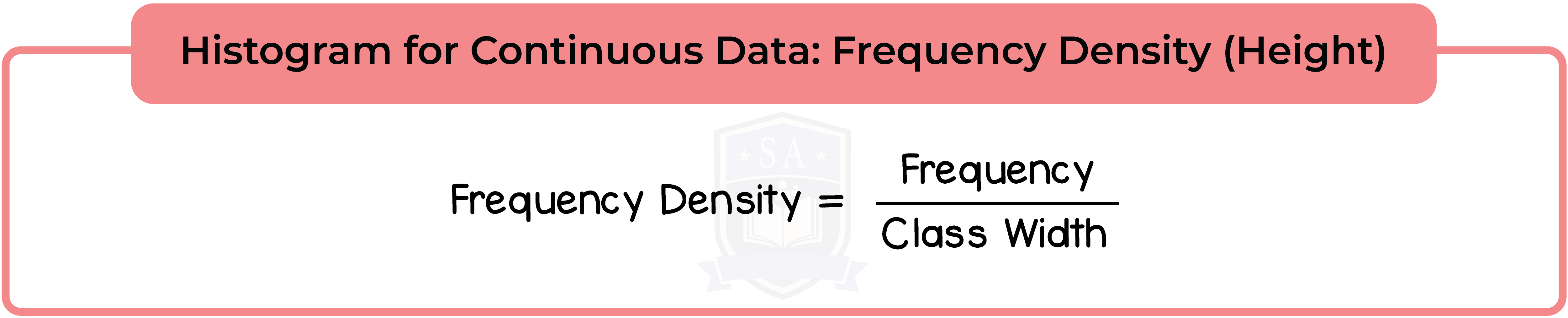
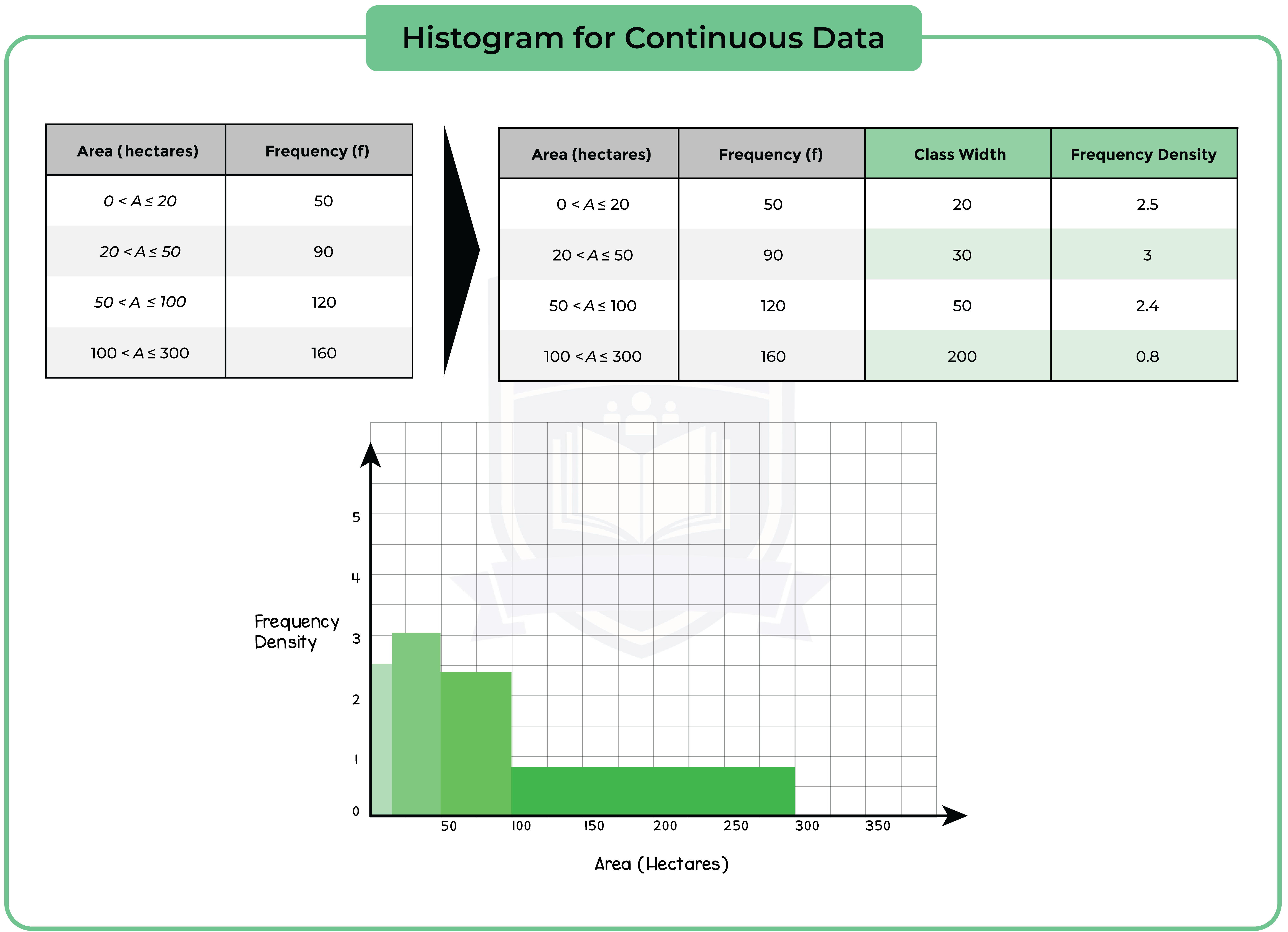
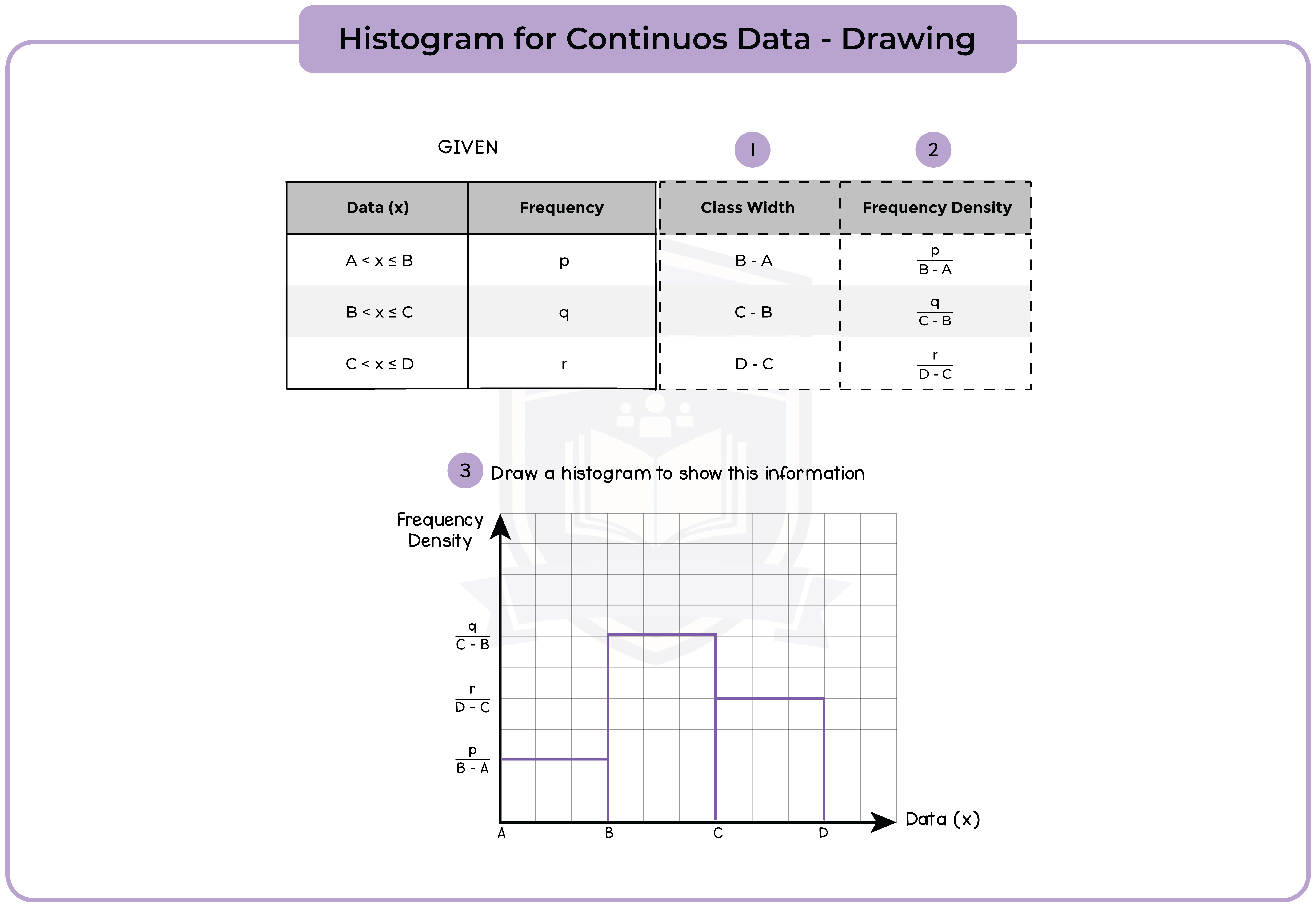
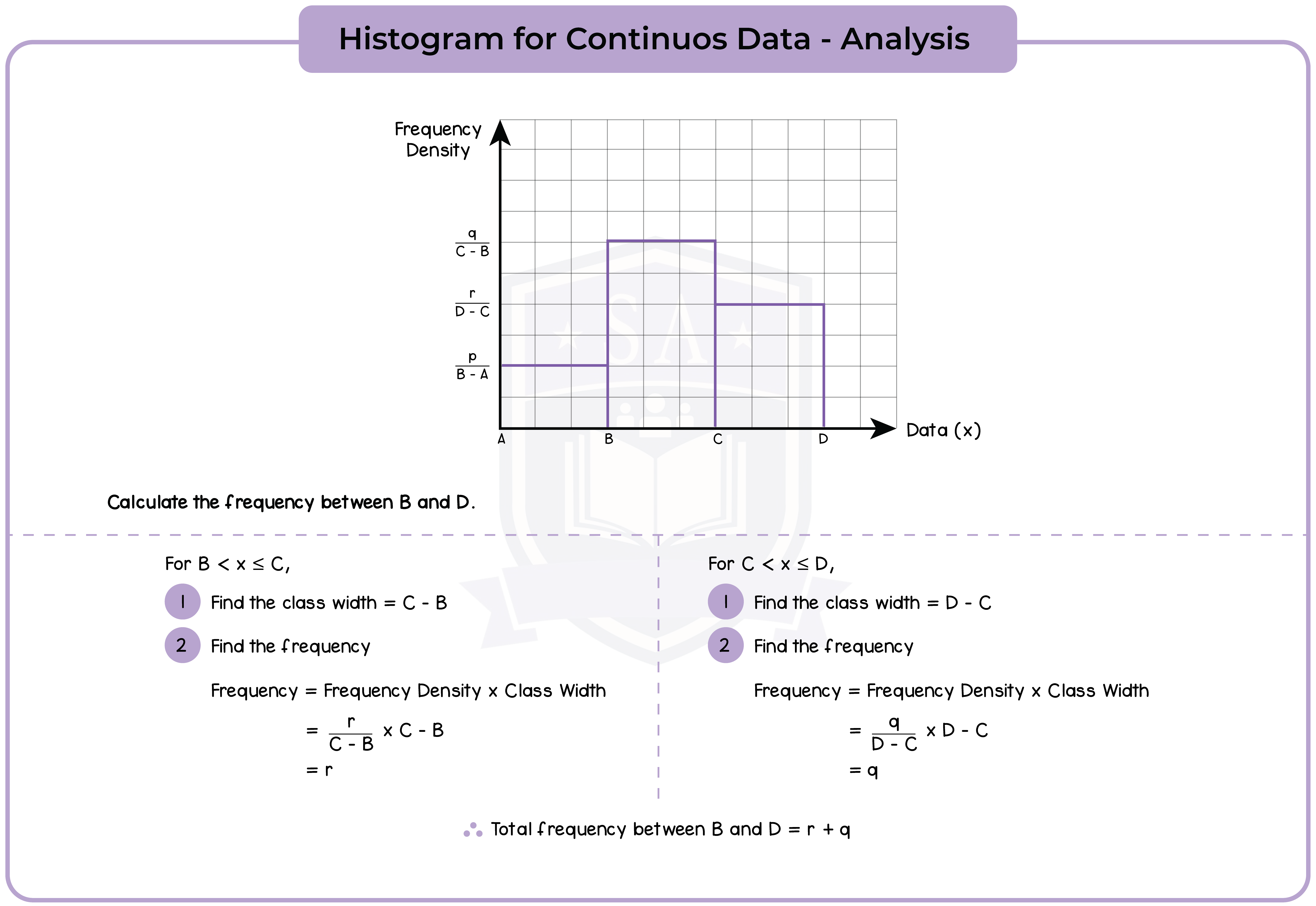
6.1.4 Construct and interpret histograms (Higher Tier Only)
A histogram uses rectangle to represent each group (or class) interval.
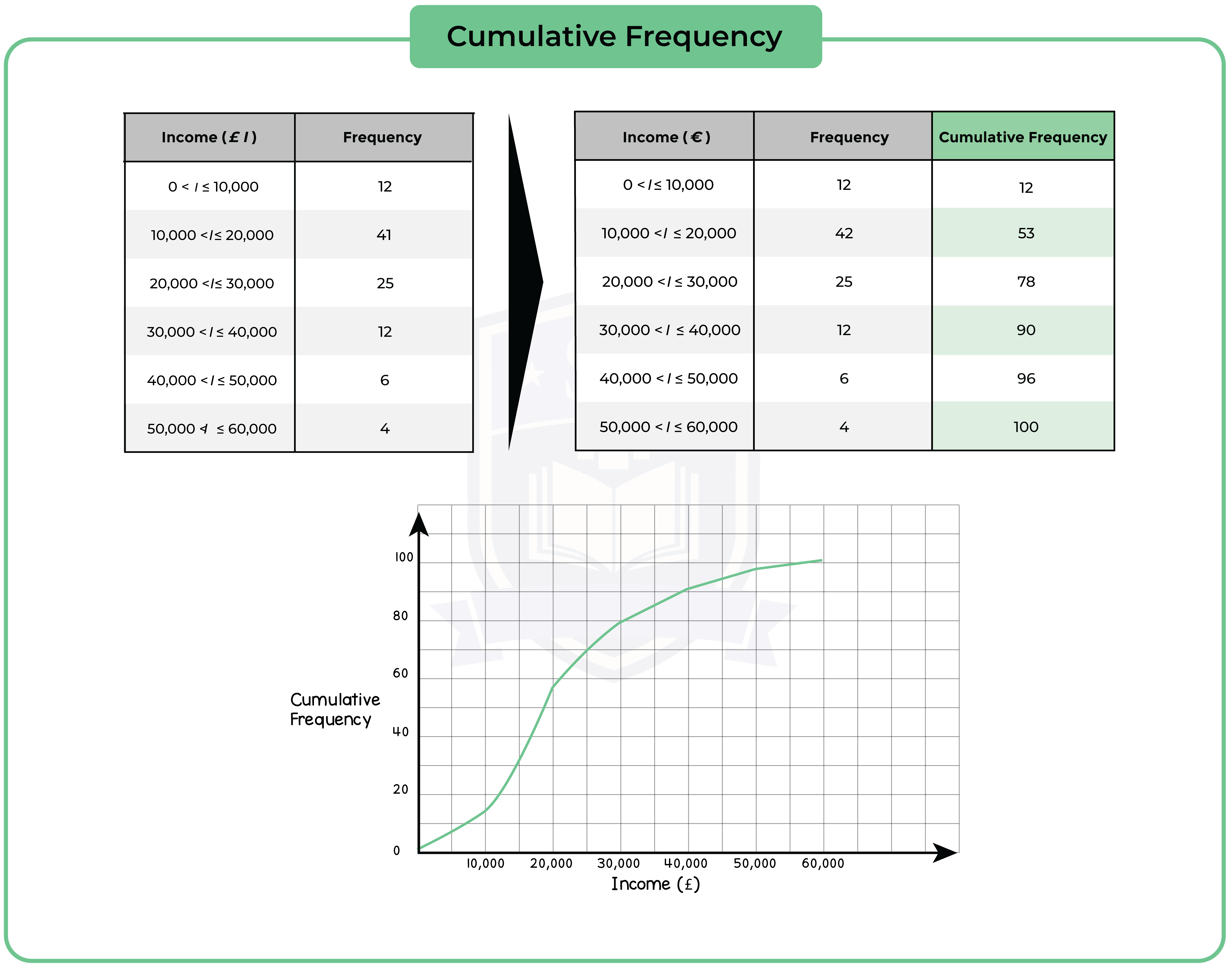
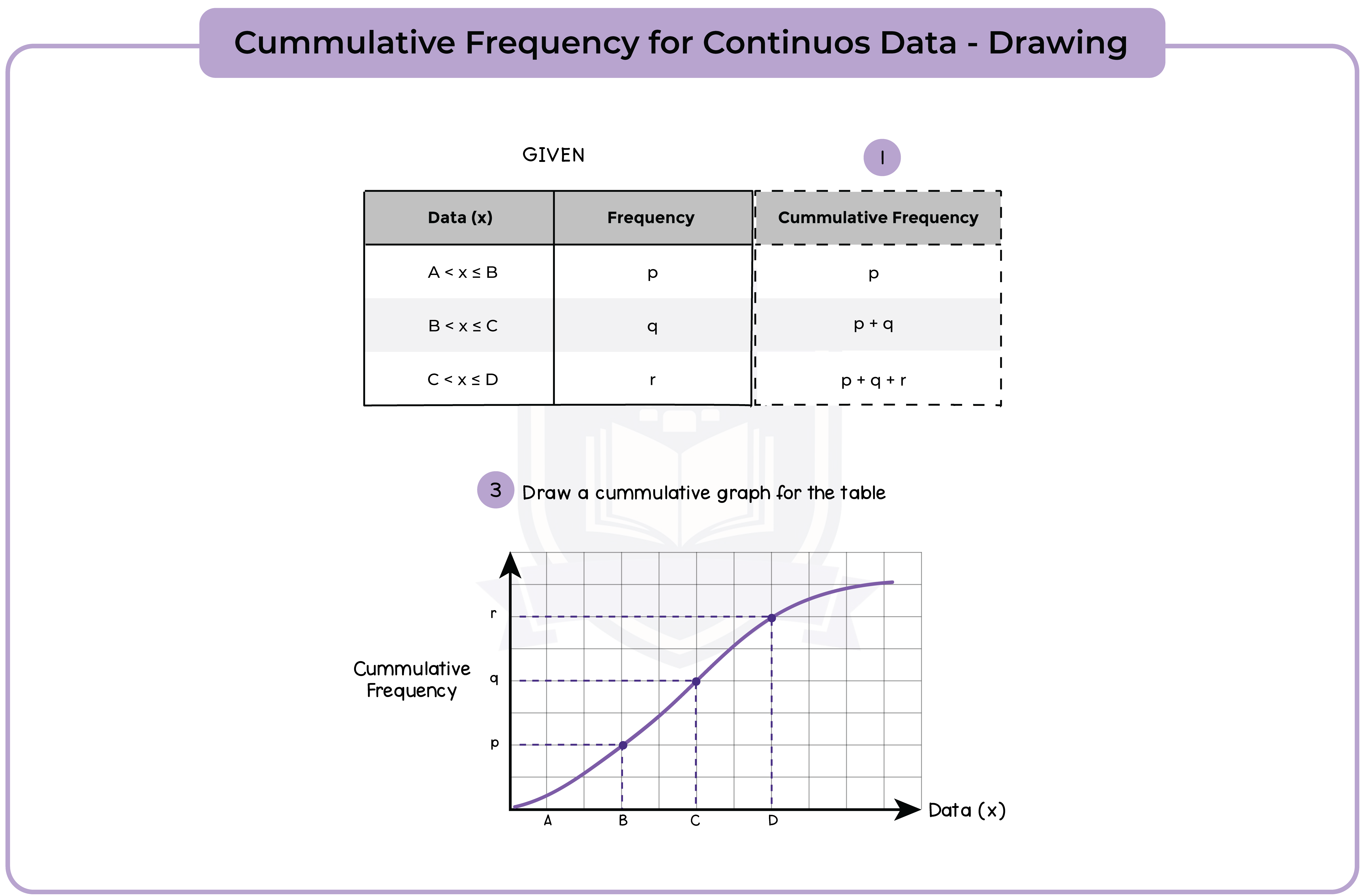
6.1.5 Construct cumulative frequency diagrams from tabulated data (Higher Tier Only)
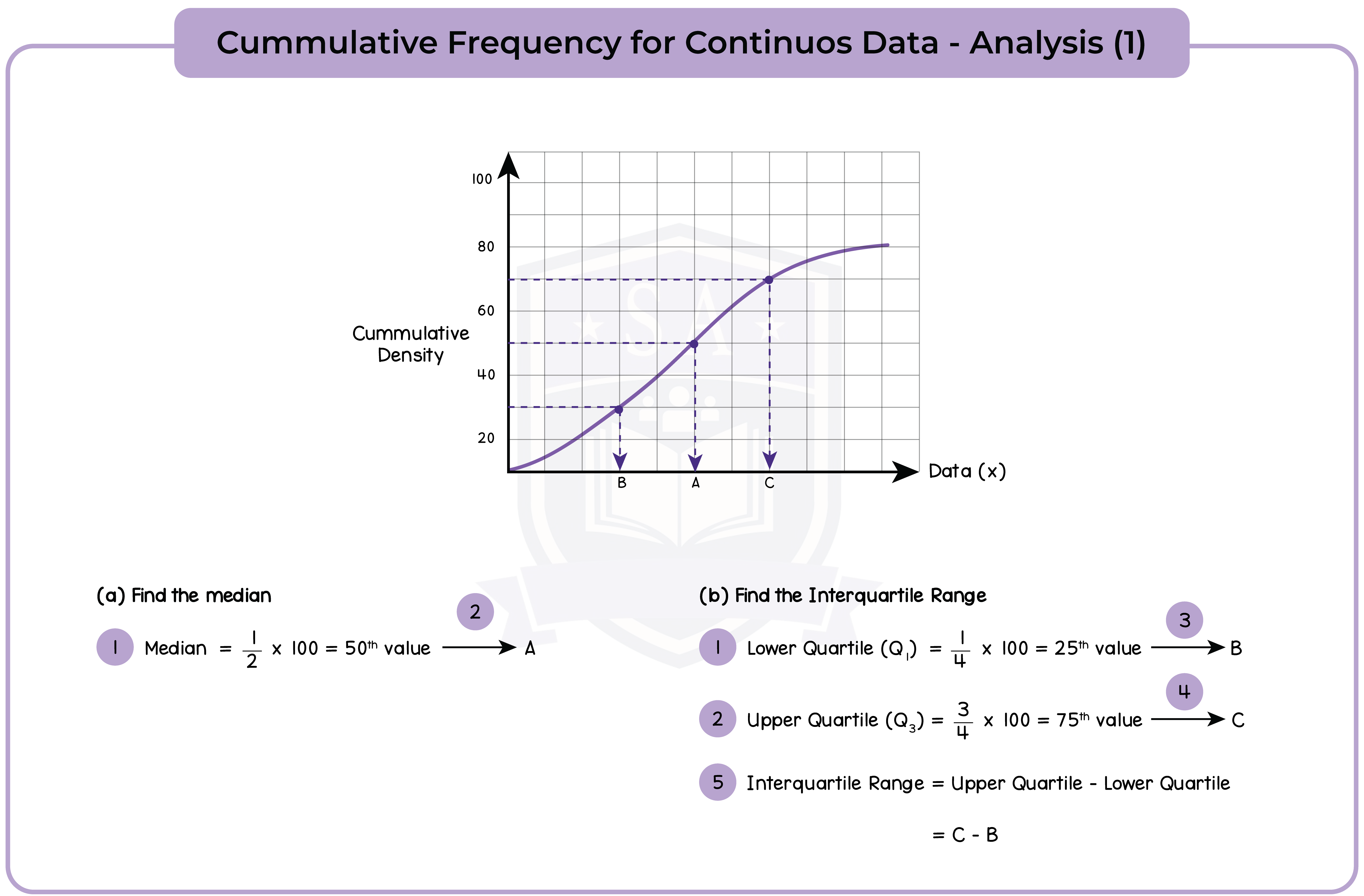
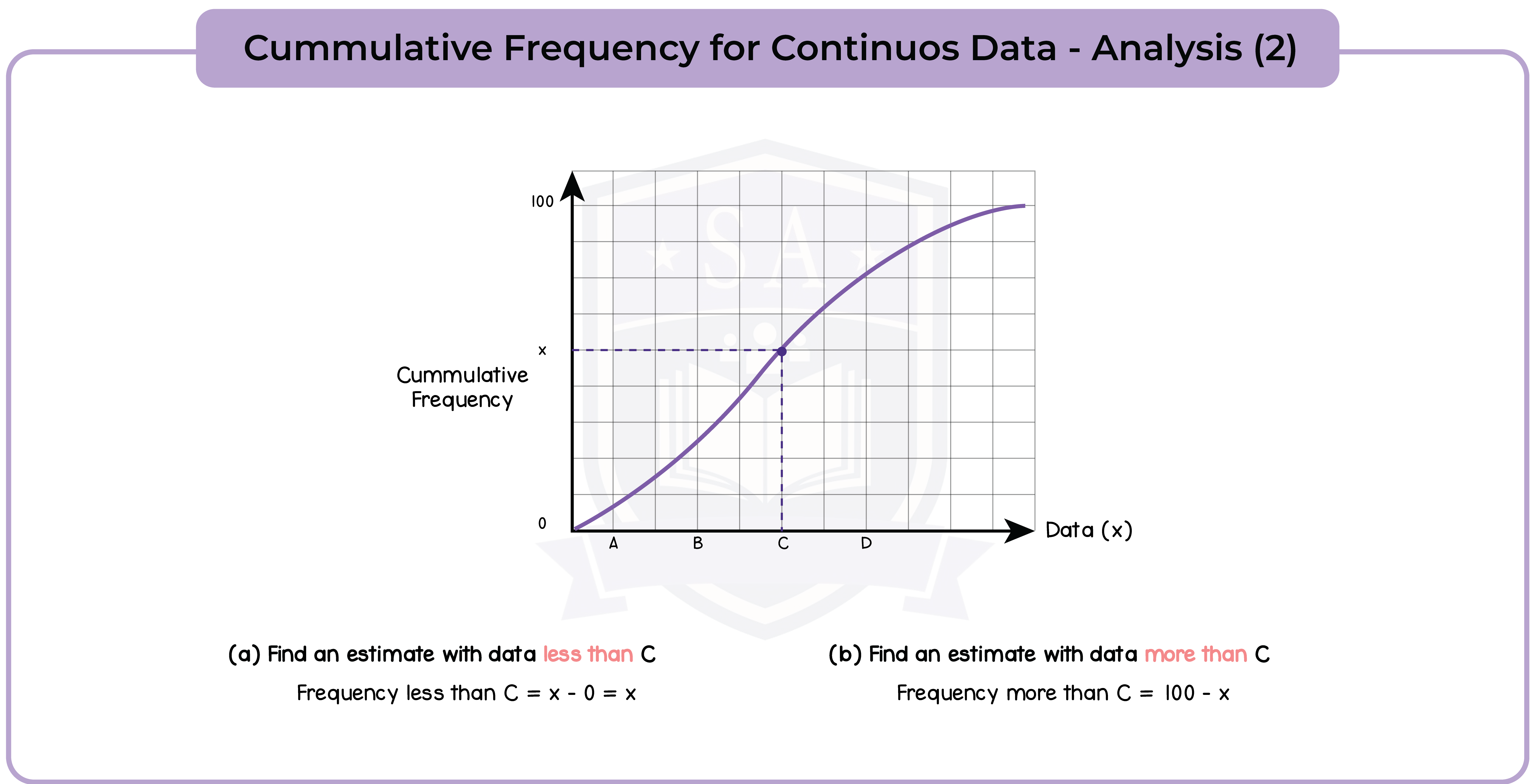
6.1.6 Use cumulative frequency diagrams (Higher Tier Only)
1.1 Integers
1.2 Fractions
1.3 Decimals
1.4 Powers and Roots
1.5 Set Language and Notation
1.6 Percentages
1.7 Ratio and Proportion
1.8 Degree of Accuracy
1.9 Standard Form
1.10 Applying Numbers
1.11 Electronic Calculator
2.1 Use of Symbols
2.2 Algebraic Manipulation
2.3 Expressions and Formulae
2.4 Linear Equations
2.5 Proportion (Higher Tier Only)
2.6 Simultaneous Linear Equations
2.7 Quadratic Equations
2.8 Inequalities
3.1 Sequences
3.2 Function Notation (Higher Tier Only)
3.3 Graphs
3.4 Calculus (Higher Tier Only)
4.1 Angles, Lines & Triangles
4.2 Polygons
4.3 Symmetry
4.4 Measures
4.5 Construction
4.6 Circle Properties
4.7 Geometric Reasoning
4.8 Trigonometry and Pythagoras’ Theorem
4.9 Mensuration of 2D Shapes
4.10 3D Shapes and Volumes
4.11 Similarity
5.1 Vectors (Higher Tier Only)
5.2 Transformation Geometry
6.1 Graphical Representation of Data
6.2 Statistical Measures
6.3 Probability
7.1 Appendix 1: Foundation Tier Formula Sheet (Given)
7.2 Appendix 2: Foundation Tier Formula Sheet (To Memorise)
7.3 Appendix 3: Higher Tier Formula Sheet (Given)
7.4 Appendix 4: Higher Tier Formula Sheet (To Memorise)
7.5 Appendix 5: Notation